In the world of design, nothing stands still. Not even in tough times. Through social media, every trend is communicated at the speed of light. And sometimes they disappear before you even have time to say *influencer*. To keep customers and *followers* interested, a full-time commitment is required.
We help you along the way and list three interesting design trends today.
1. This year's new design word - Neomorphism
Forget flat design, now Neomorphism is the thing. The look should reflect what we see in reality. The design elements should feel like you can touch them. The trend is repeated for invitation cards, Instagram updates, flyers and everything you can think of. It started in the 90s with menu symbols. The floppy disk icon became the Save and Return Arrow, and Cancel. Fast forward 30 years and translate to 3D but without print. The multi-dimensional feeling comes only from looking at the design. The boundary between image and reality is blurred.
But not everyone in the industry is convinced. Reflecting several dimensions in print is complicated and the benefits are debatable. Many designers argue that lifelike buttons and other elements create curiosity and elicit a reaction, which is exactly the purpose of design. In time, we'll see if the multi-dimensional look is here to stay.
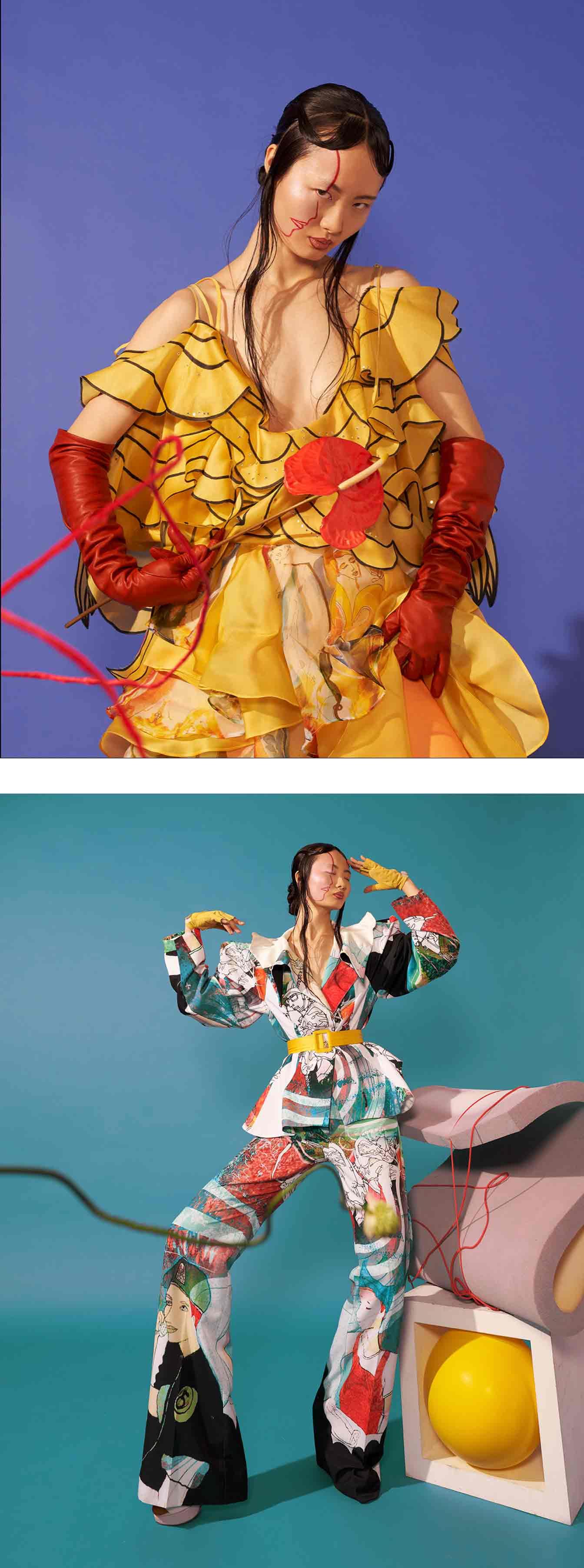
2. Colours with contrast
What will be the colour of this year? It's the same show every year. The design world is tying itself in knots when it comes to choosing this year's colour. And how do you find a colour that beats last year's fluffy, imaginative Millennial Pink? Not to mention the now cult-like effect of Flosskuggan.
Trends change with the wind and the winning colour of subsequent years rarely resembles its predecessor. For the current year, we're seeing a distinct lack of pastels. Lush lava, Phantom Blue and Water Tone are as bright as Millennial Pink was muted. The colours are more vibrant and embrace a bolder contrast. If you want to attract attention, you're spot on.
The big difference, of course, is just that – to increase your heart rate. Not like with Millennial Pink which had a zen-like effect. Follow the trend and don't be afraid to use a proper splash of the new colour. No one will remain unaffected. Think harmony disharmoniously. It doesn't matter if the first impression creates chaos in the sense of order. Put calm, well-composed designs aside for the rest of the year.
Instavites' invitation card templates can be customised with any colour combination to suit. Start from any template and add the colour code you're looking for.
3. Don't follow the beaten path
Anarchy. No, don't go throwing stones at shop windows. But this year breaks all established rules on colour composition and those who stick to traditional patterns are guaranteed to fall behind. Rebellion is in the air. Whether it's about environmental policy, mainstream politics or colour combinations. Follow established norms but do the opposite. How do we break the rules when we create student invitations and summer designs for the 50th anniversary party? Choose and mix typefaces that no one could have imagined. Images and symbols are composed against the laws of nature. The rule book goes in the bin and for those invited, expectations for this year's party soar.
Graphic design is a dynamic and constantly evolving field that reflects the changing times and preferences of consumers and businesses. More trends this year:
Hand-drawn illustrations: These are bespoke drawings that add a touch of authenticity and personality to designs. They can be used to convey emotions, stories, or messages in a unique way. Save as .svg and upload to our design editor.
Surrealism: This is a style that blends reality and fantasy, creating designs that are imaginative and unexpected. Surrealism can be used to grab attention, spark curiosity, or express creativity.
Colourful minimalism: This is a trend that combines simplicity and vibrancy, using minimal elements and bright colours to create designs that are clean and eye-catching. Colourful minimalism can be used to highlight important information, create contrast, or convey a mood.
Maximalism: This is the opposite of minimalism, using multiple elements, colours, typefaces, and patterns to create designs that are bold and expressive. Maximalism can be used to create a sense of diversity, energy, or fun.
Data visualisation: This is a trend that involves using graphics to present data in a clear and engaging way. Data visualisation can be used to communicate complex information, reveal insights, or persuade audiences.
Candy-coloured pastels: These are soft and sweet colours that create a sense of warmth and comfort. Candy-coloured pastels can be used to appeal to emotions, create a nostalgic feel, or target a specific demographic.
Natural patterns and textures: These are designs that mimic the shapes and surfaces of nature, such as plants, animals, rocks, or water. Natural patterns and textures can be used to create a sense of organic quality, harmony, or realism.
Diversity and inclusion: This is a trend that reflects the social and cultural values of today's society, using designs that represent different groups of people, such as race, gender, age, or ability. Diversity and inclusion can be used to show respect, empathy, or solidarity.
These are just some of the current trends in graphic design. Of course, trends aren't rules, and you can always experiment with your own style and preferences. The most important thing is to create designs that suit your purpose and audience. When adding templates to Instavites, we always take current trends into account. Check it out.